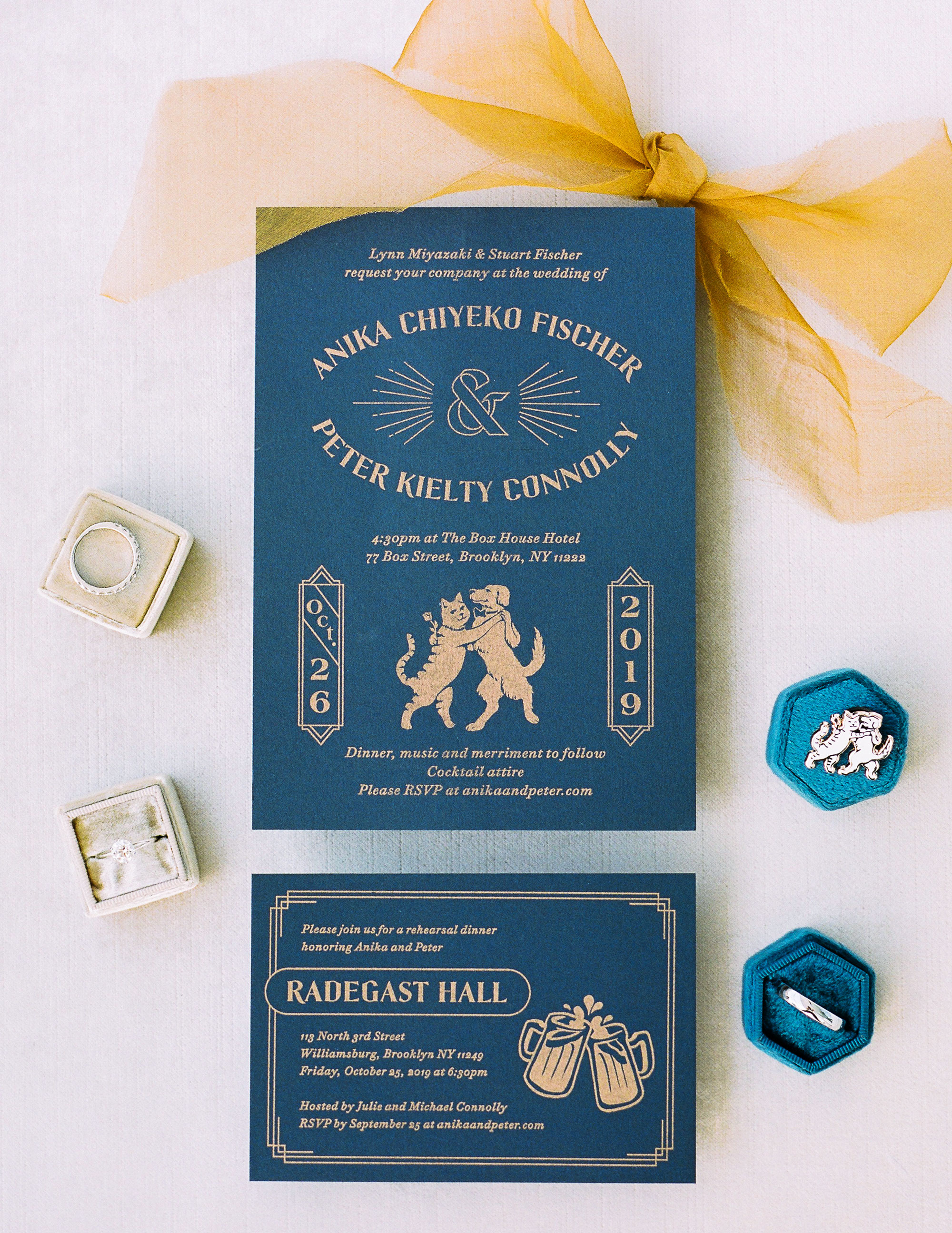
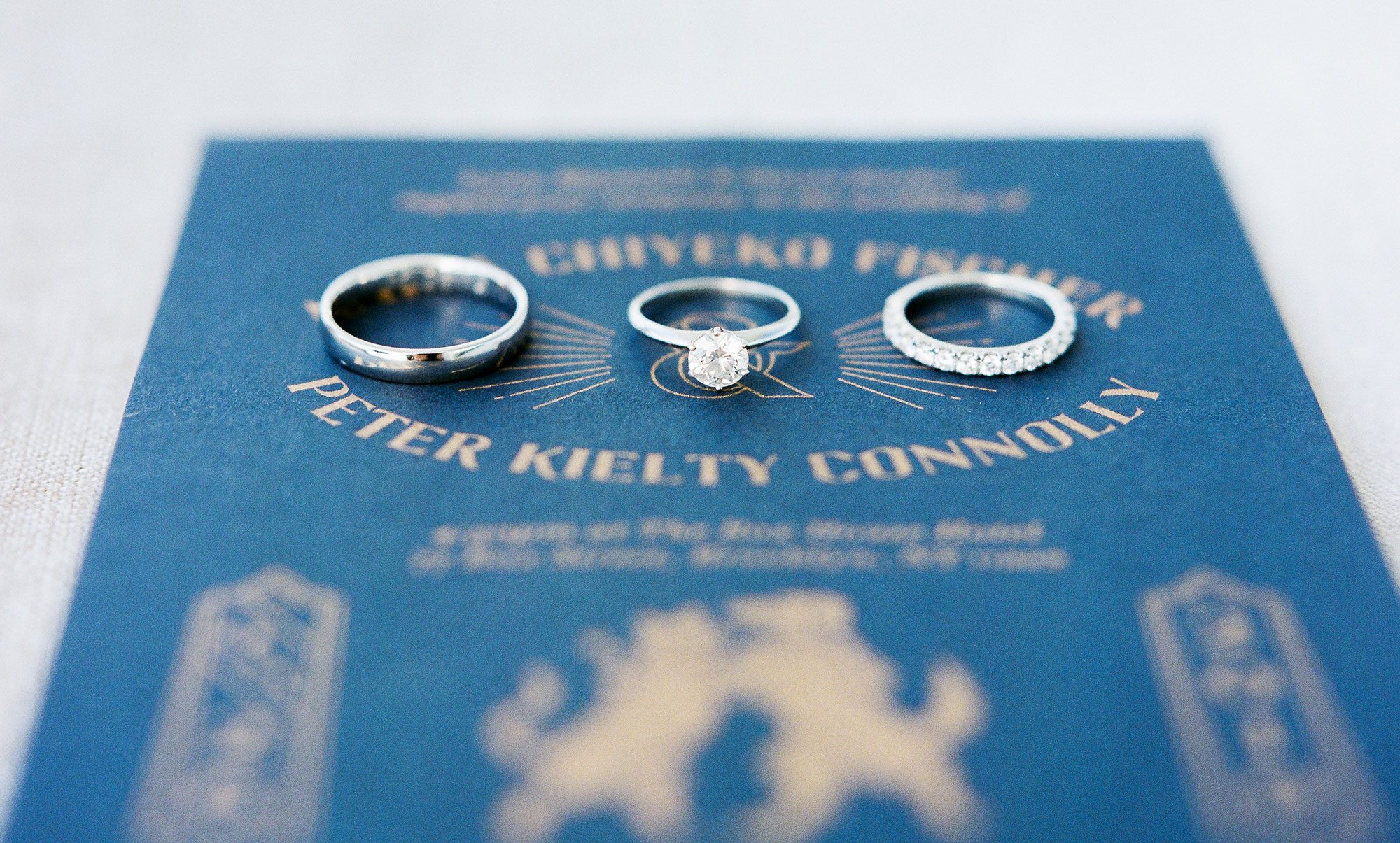
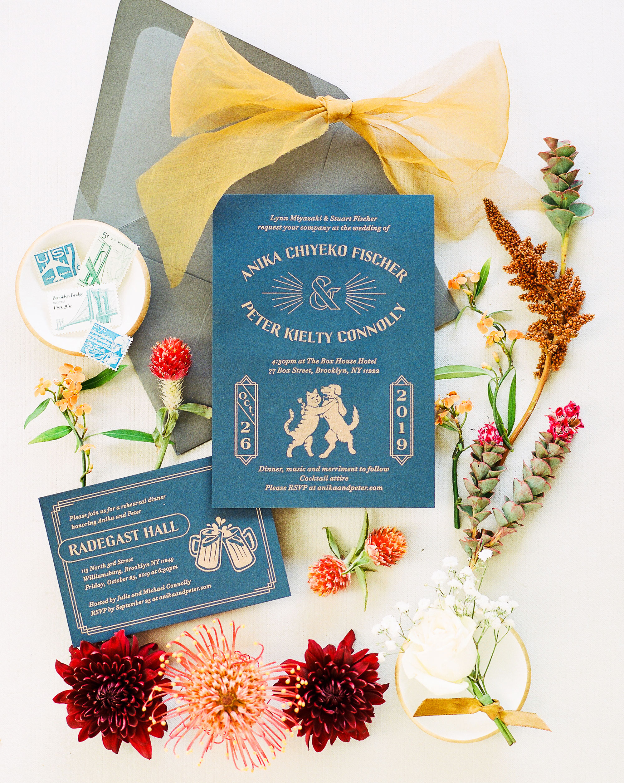
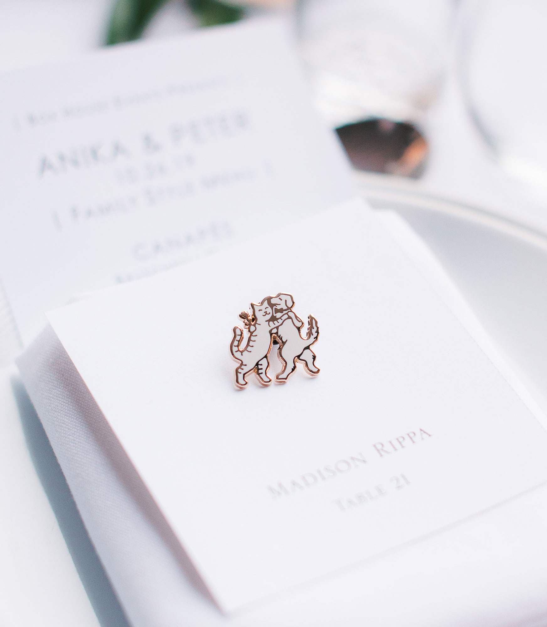
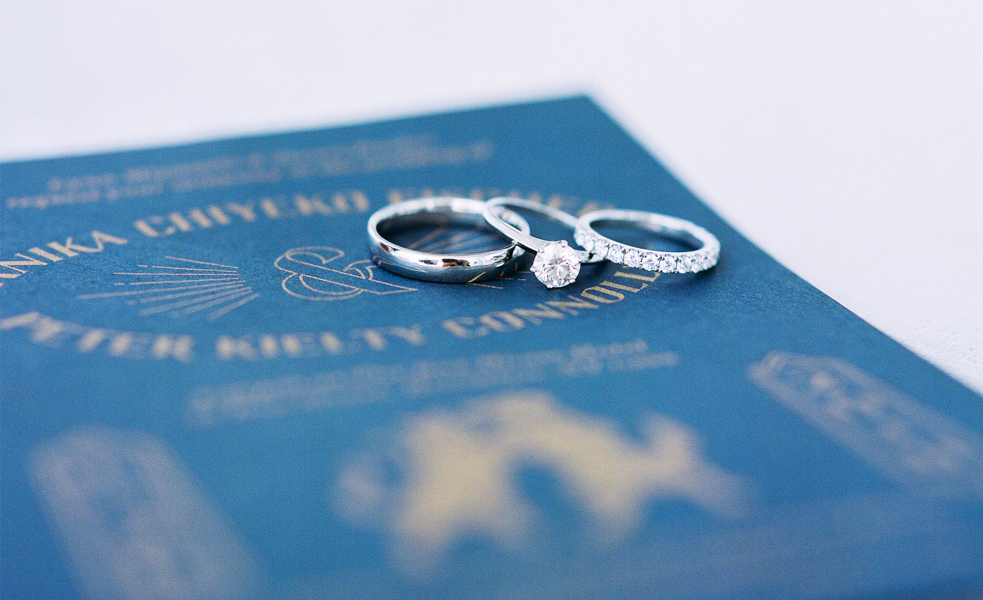
ANIKA & PETER
For this suite, the bride and groom wanted a playful, yet elegant tone, and after some initial ideas were considered, we ended up with the idea of a cat and dog dancing, a nod to their respective “spirit animals”, so to speak.
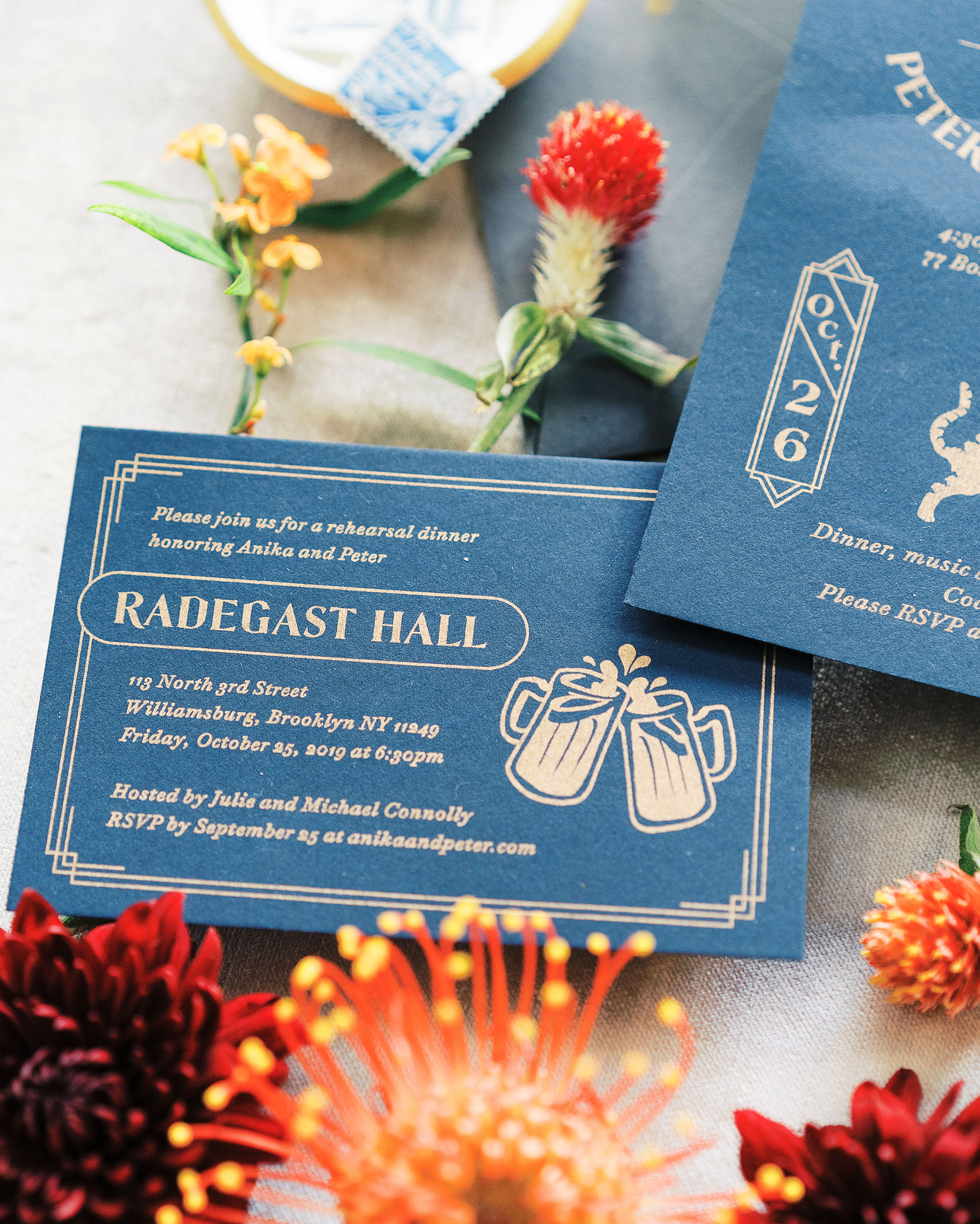
These were printed using Risograph on navy stock, with gold ink. Additional assets incorporated the dog and cat motif, including enamel pins that were laid out for each guest at their table seating, as well as commemorative pint glasses for guests to take home.
These were printed using Risograph on navy stock, with gold ink. Additional assets incorporated the dog and cat motif, including enamel pins that were laid out for each guest at their table seating, as well as commemorative pint glasses for guests to take home.

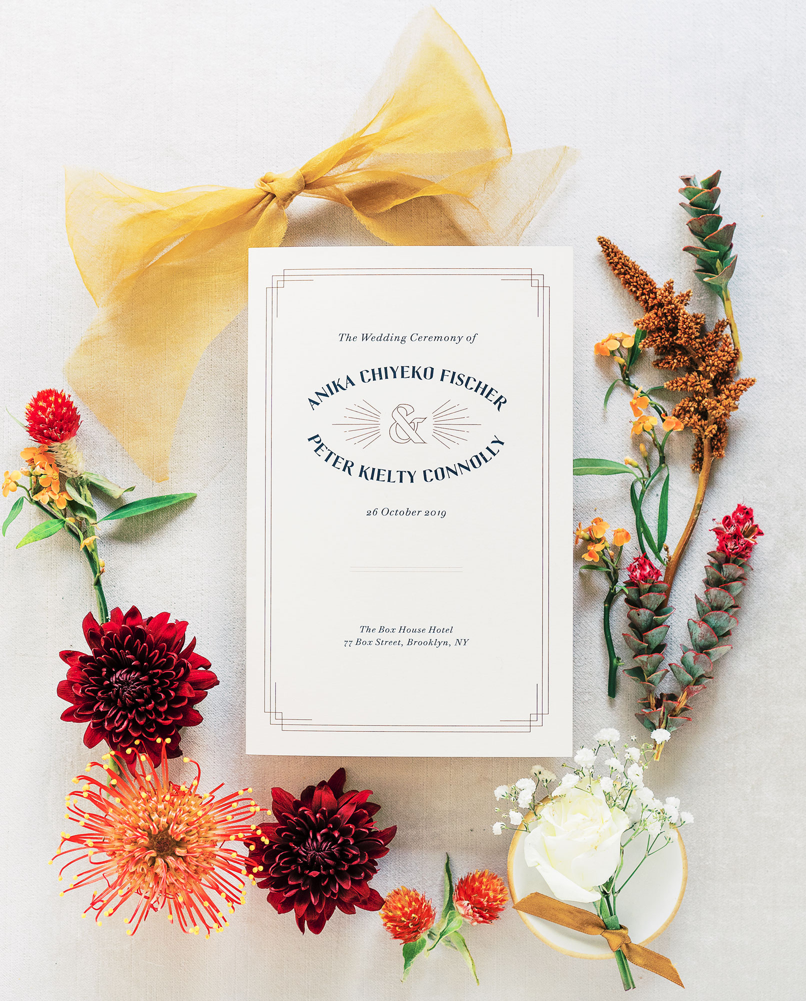
MARI & MAX
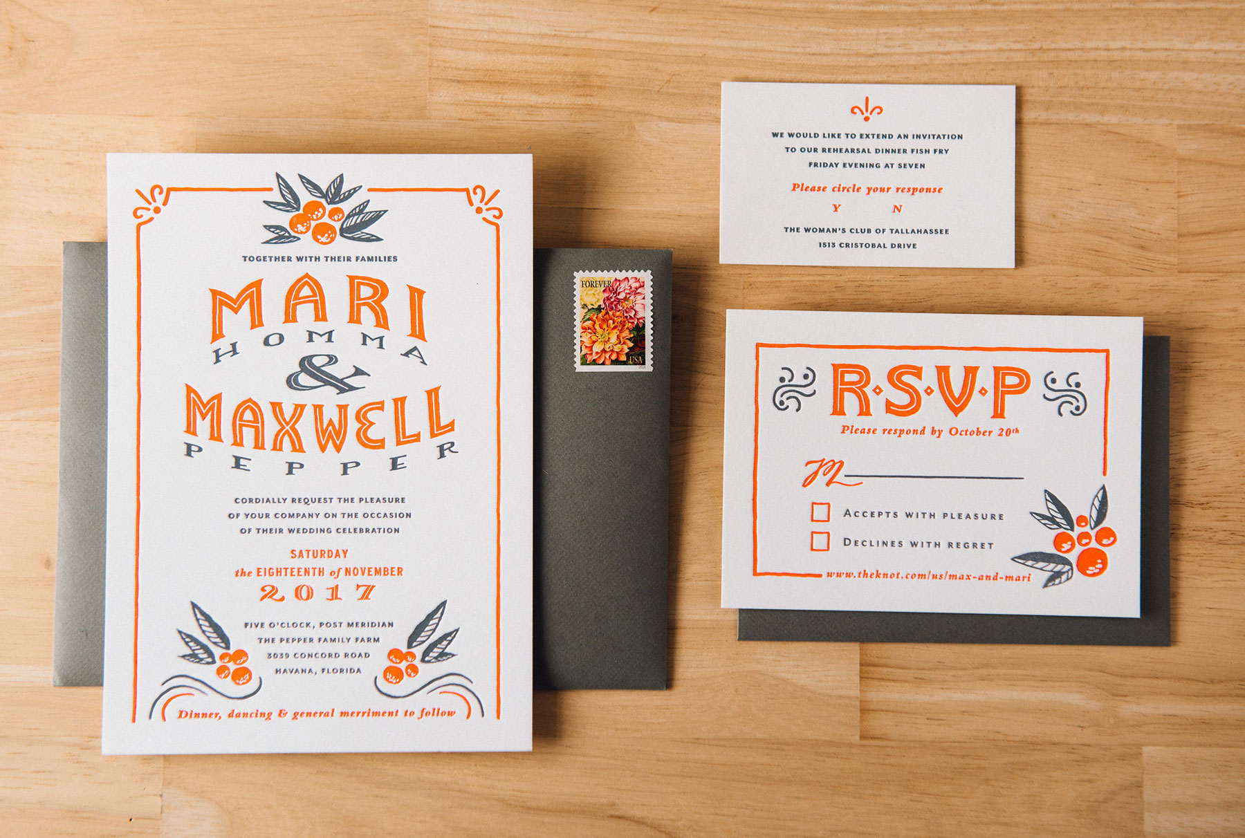
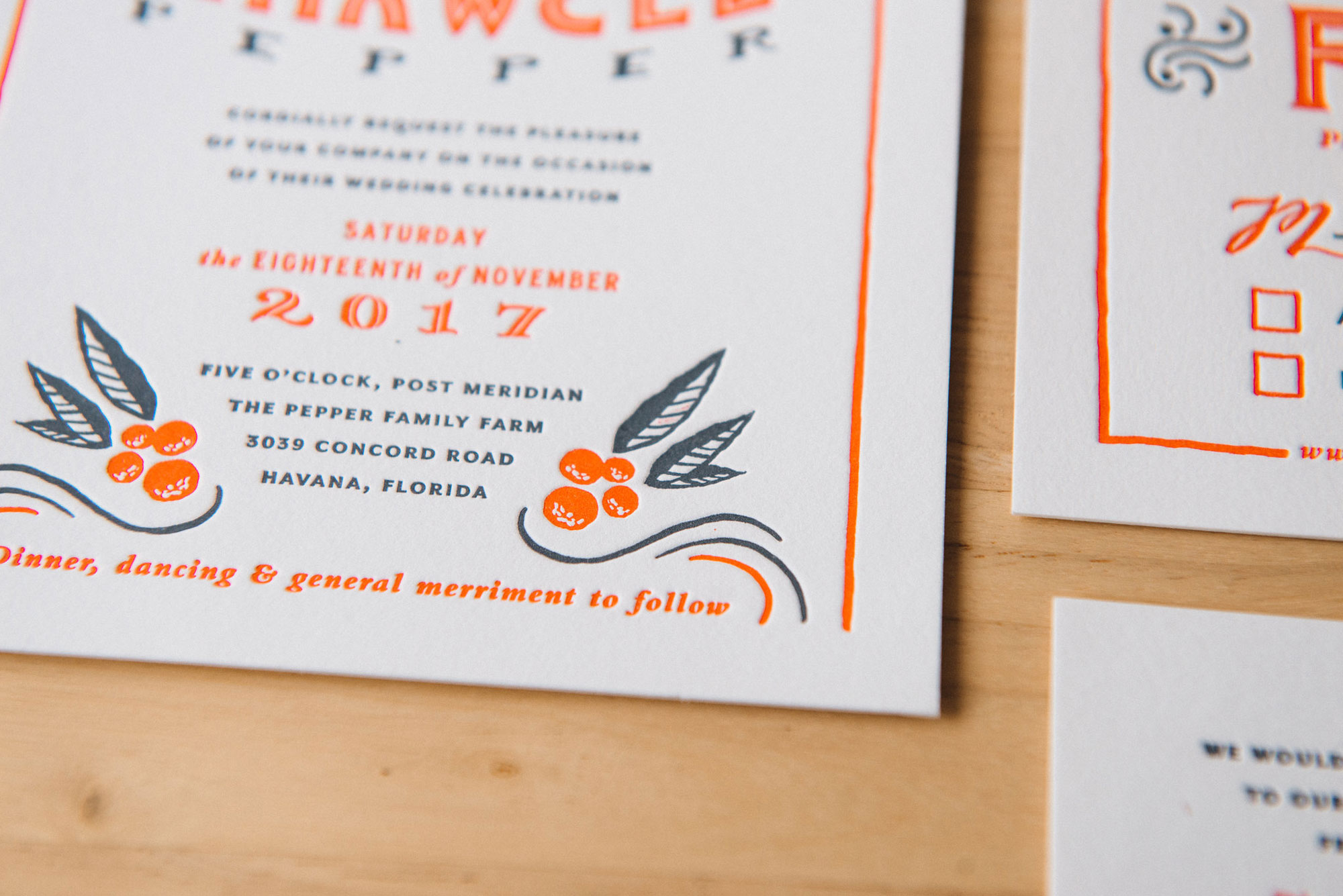
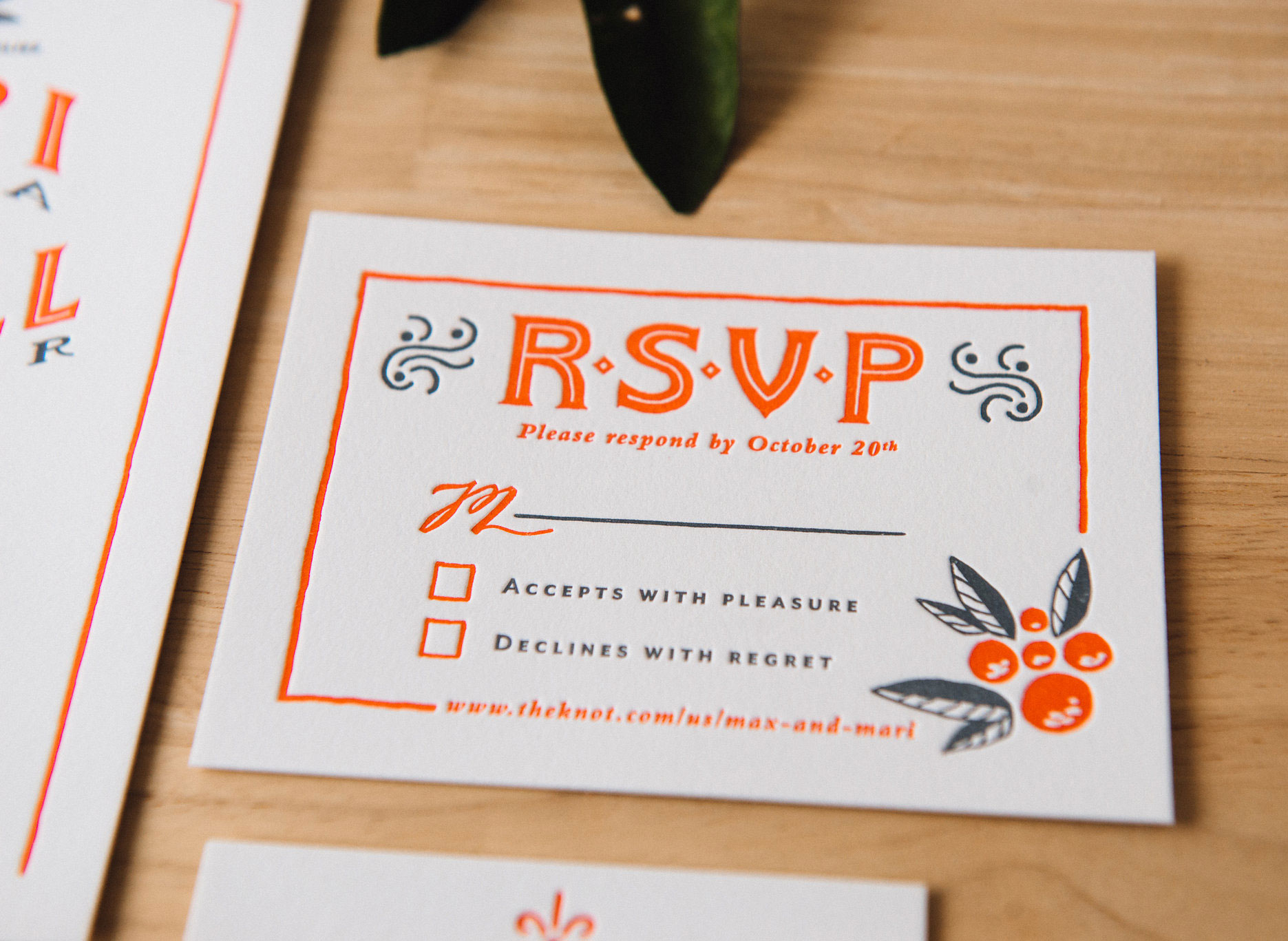
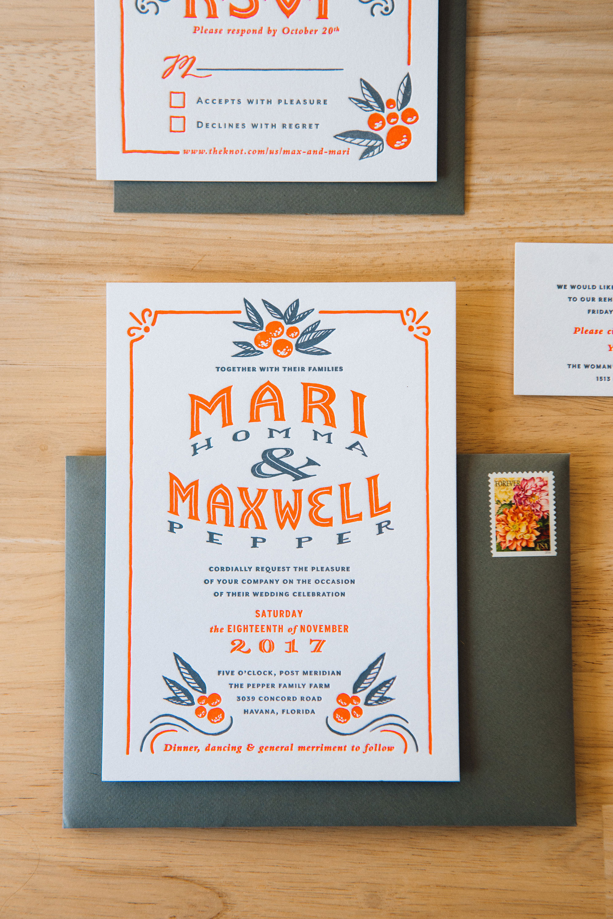
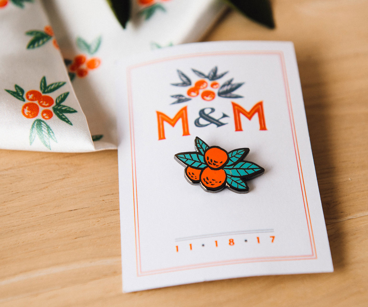
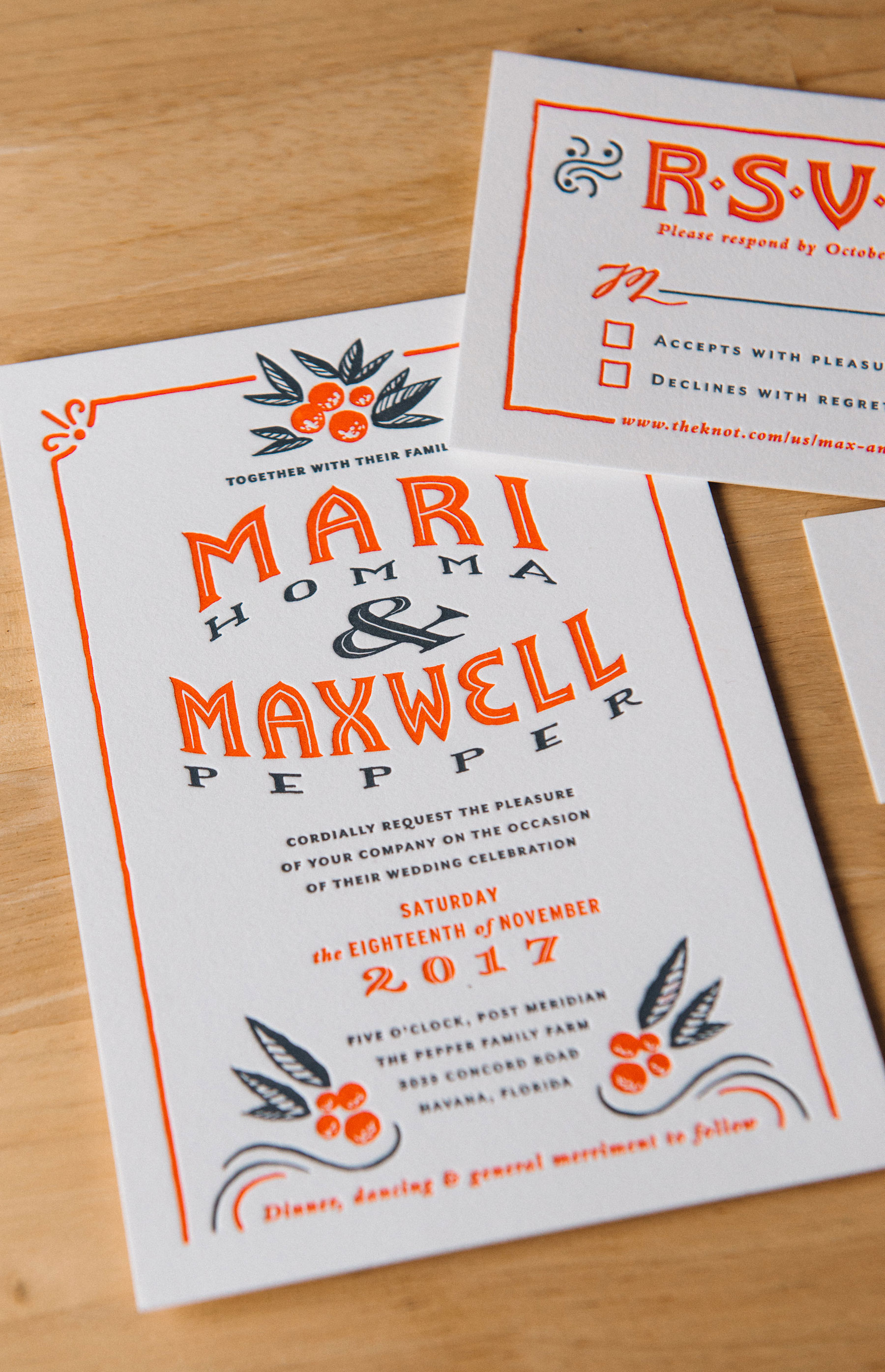
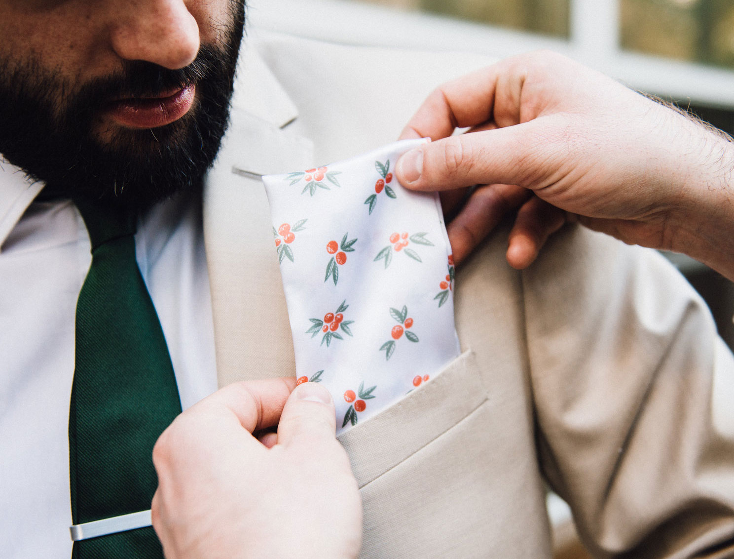
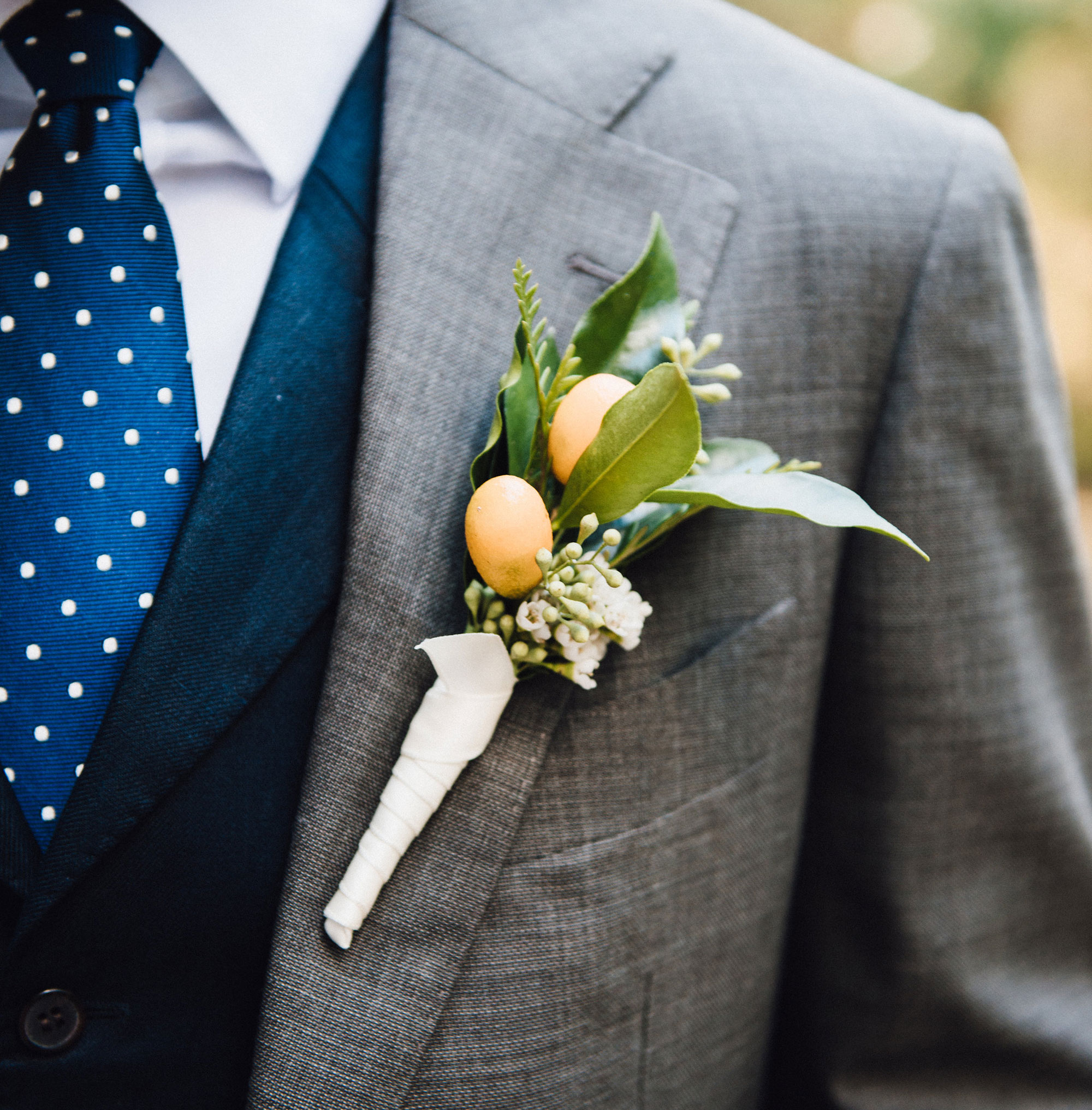
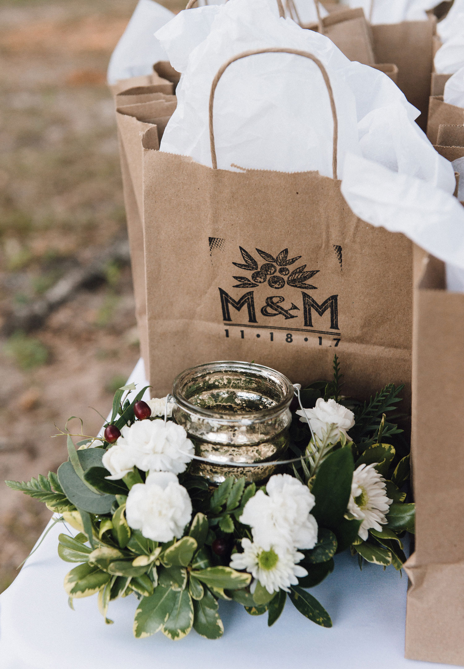
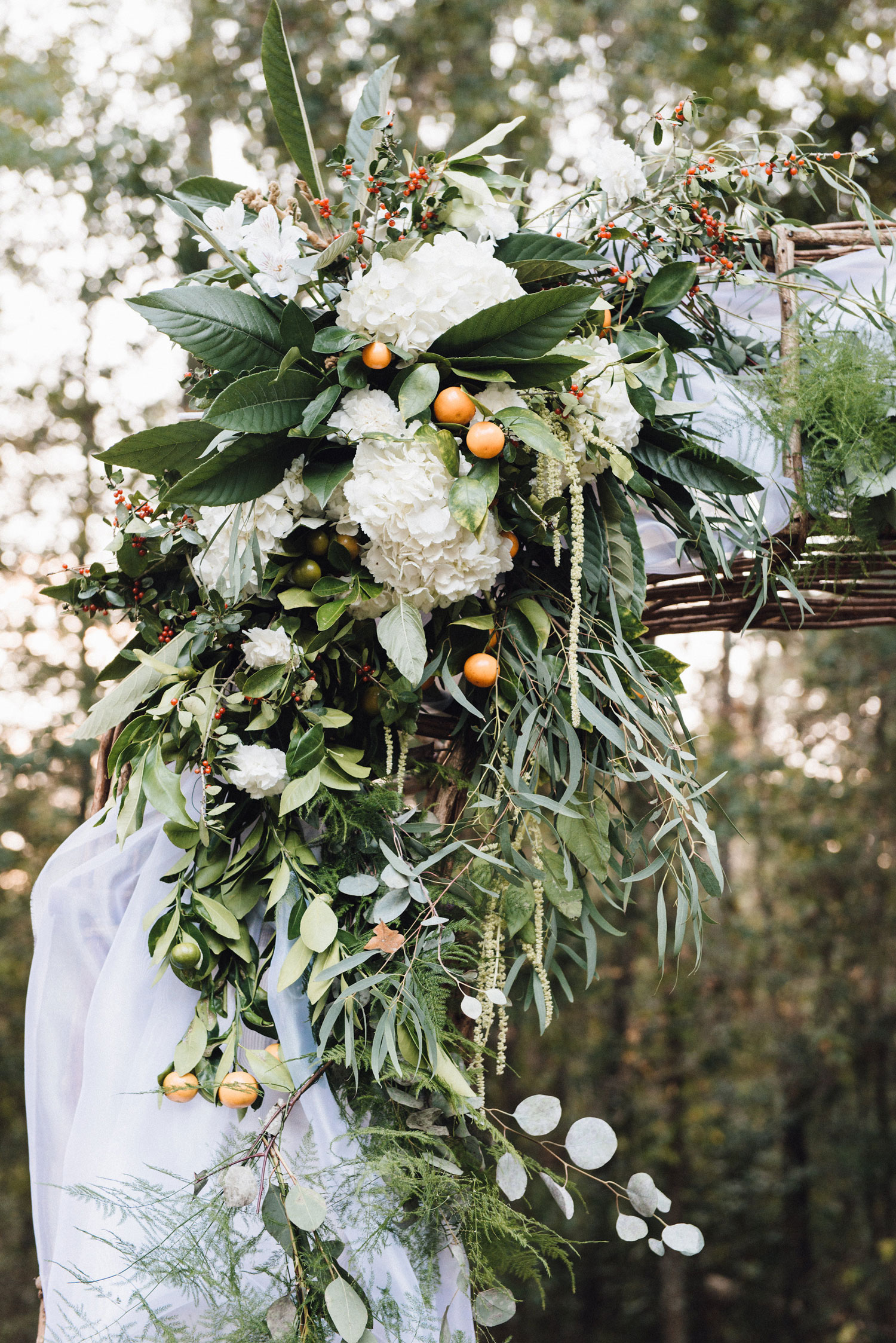
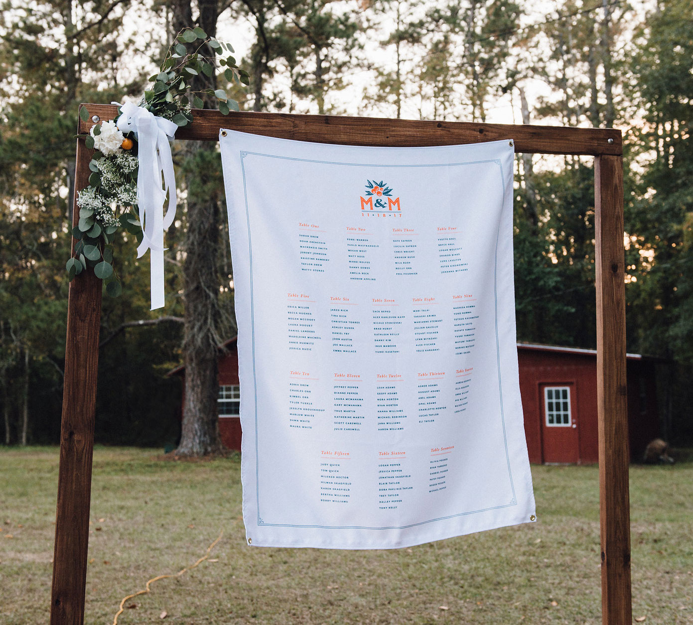
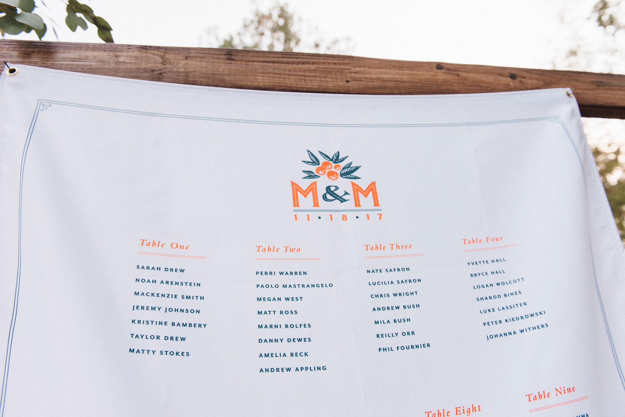
For my own wedding, I naturally used it as an opportunity to create a personalized suite of assets with a strong theme throughout (and hopefully save a little money!). Given that it was in November in my native north Florida, which is citrus season, we quickly decided to use that as a jump off point. We featured a citrus motif and monogram lockup for various assets, including custom-printed silk pocket squares for the groomsmen, enamel pins for guests with accompanying card backing, matchboxes, stamps, and even coozies (this was Florida, after all!)
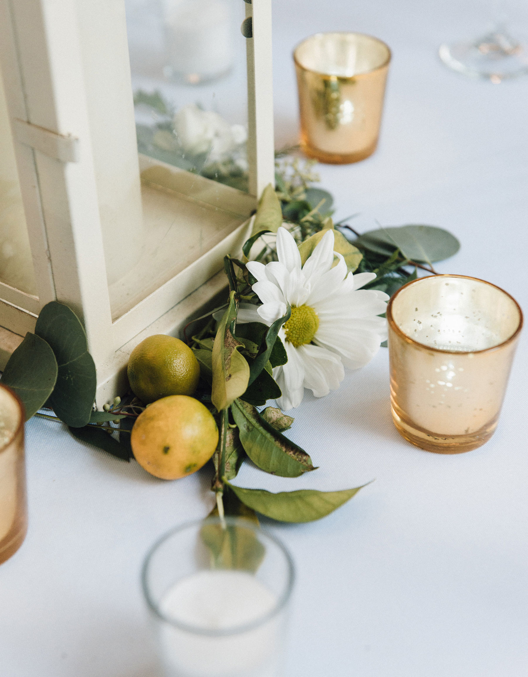
My parents have a satsuma tree in their backyard which we intended to use for table decorations and to include in gift bags, but as is often the ironic case when planning a wedding, the tree had a very weak harvest that year... So we went with smaller calamondins, kumquats, and whatever other local citrus we could find. I even got to sport a fun kumquat boutonnierre!
For the invitations themselves, this was also an excuse to do my own letterpress printing at The Arm letterpress studio in our local Williamsburg, Brooklyn. I put my previous pre-press experience working at a Manhattan print shop to prepare files for plate-making, using the services of Boxcar Press in upstate New York. This was a lot of fun, and after designing stationery and invitations for letterpress in the past, this was my first time using the machine. Always a treat to explore new printing methods.
Photos by aliciaosbornephoto.com


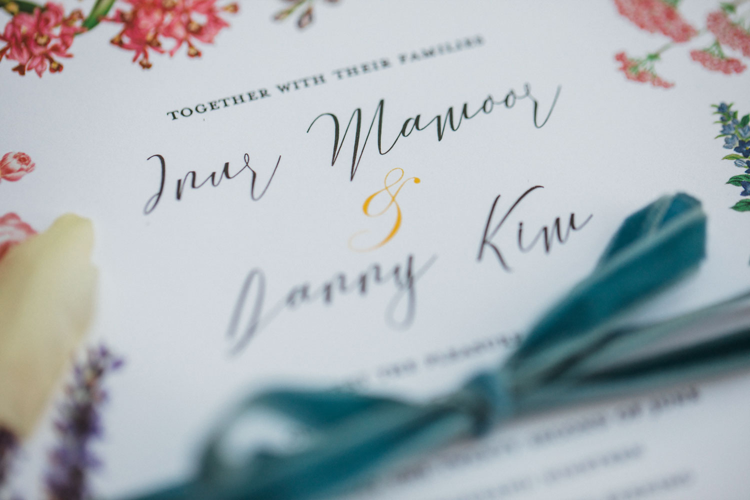
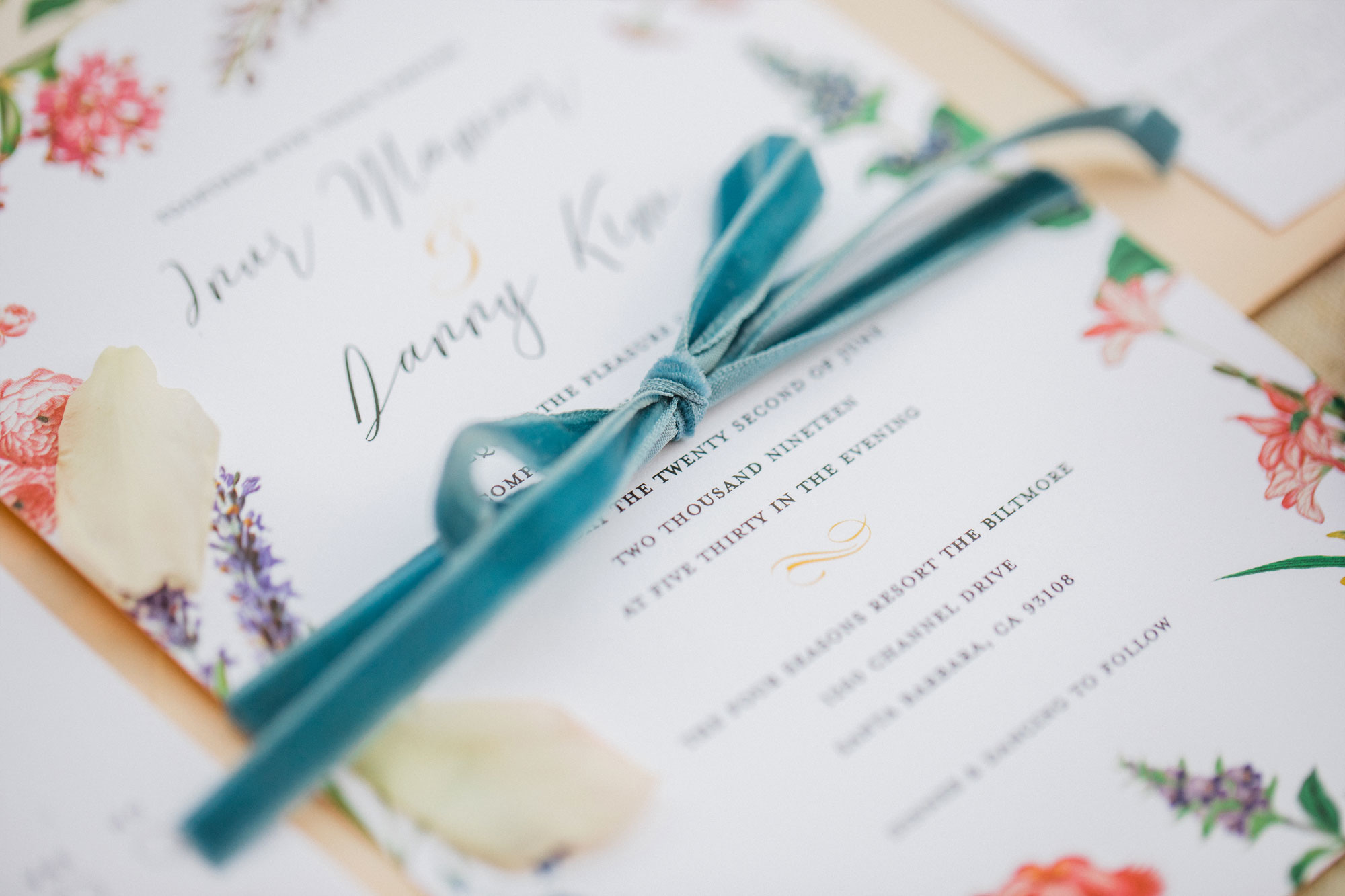
DANNY & INUR
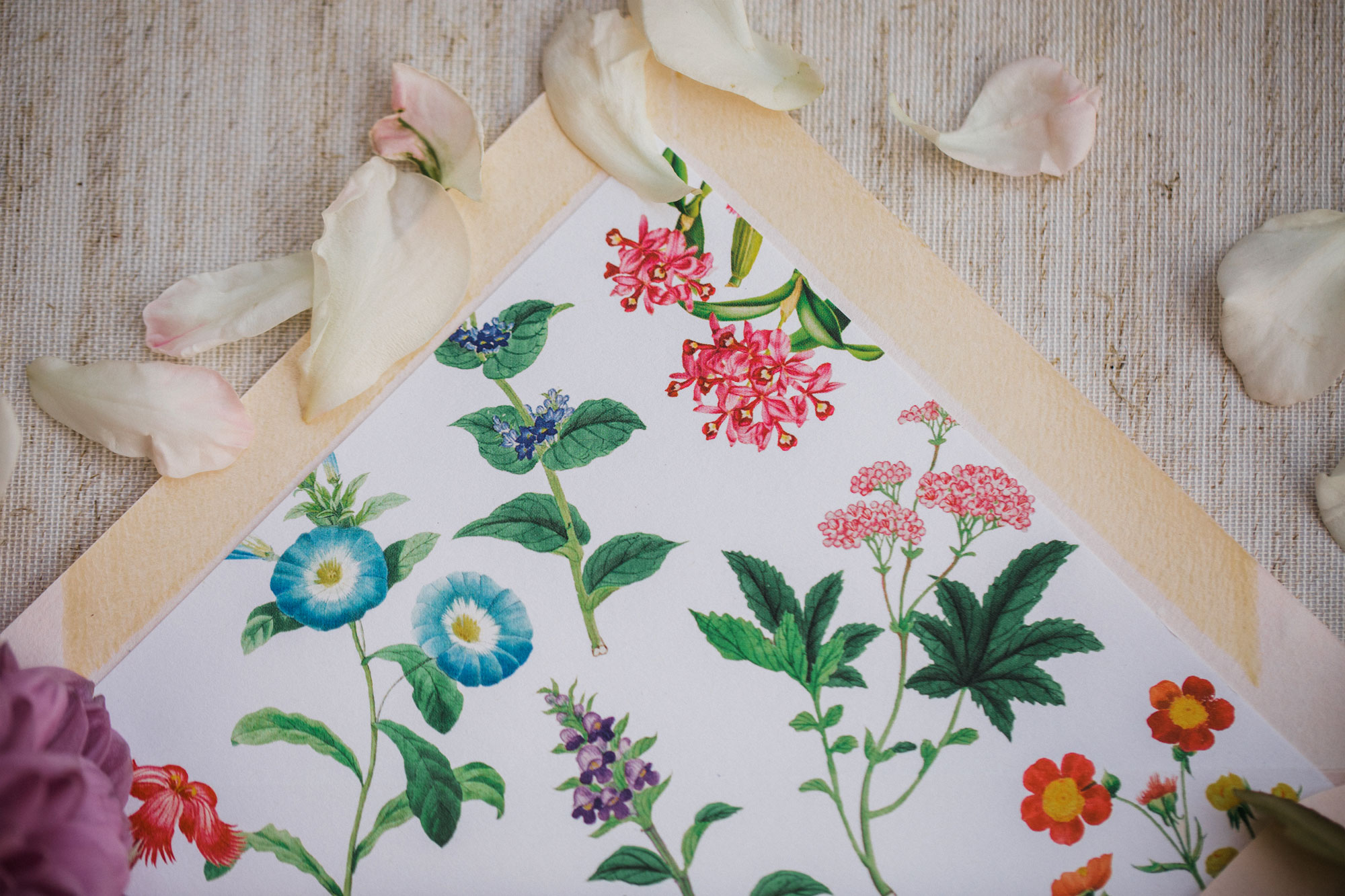
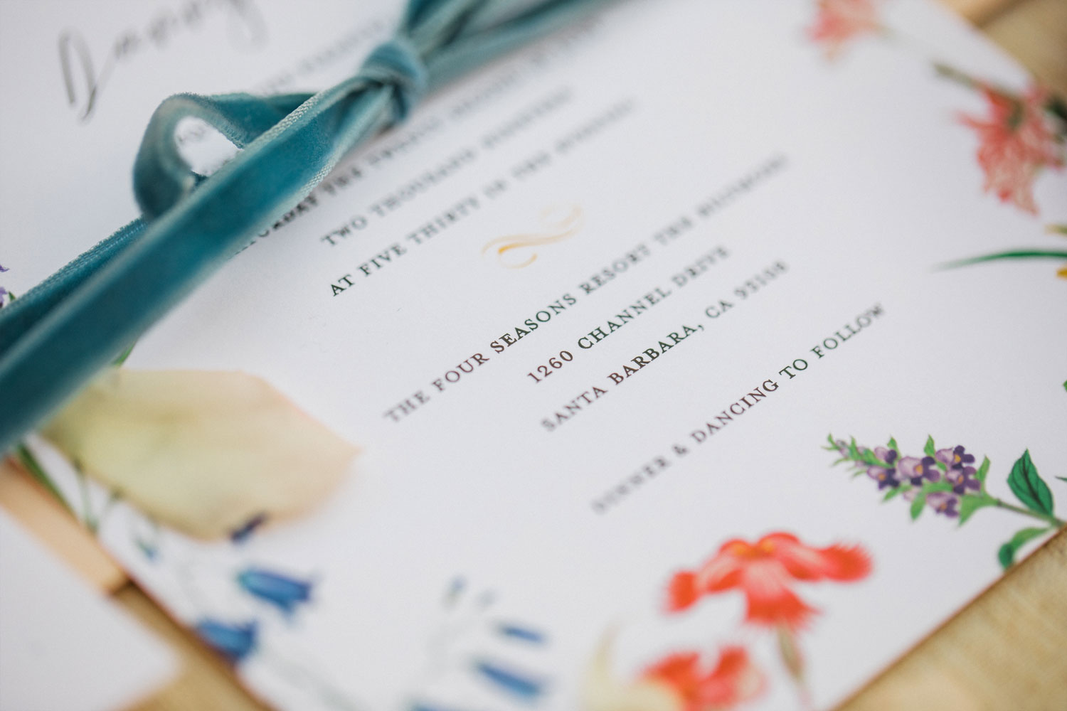
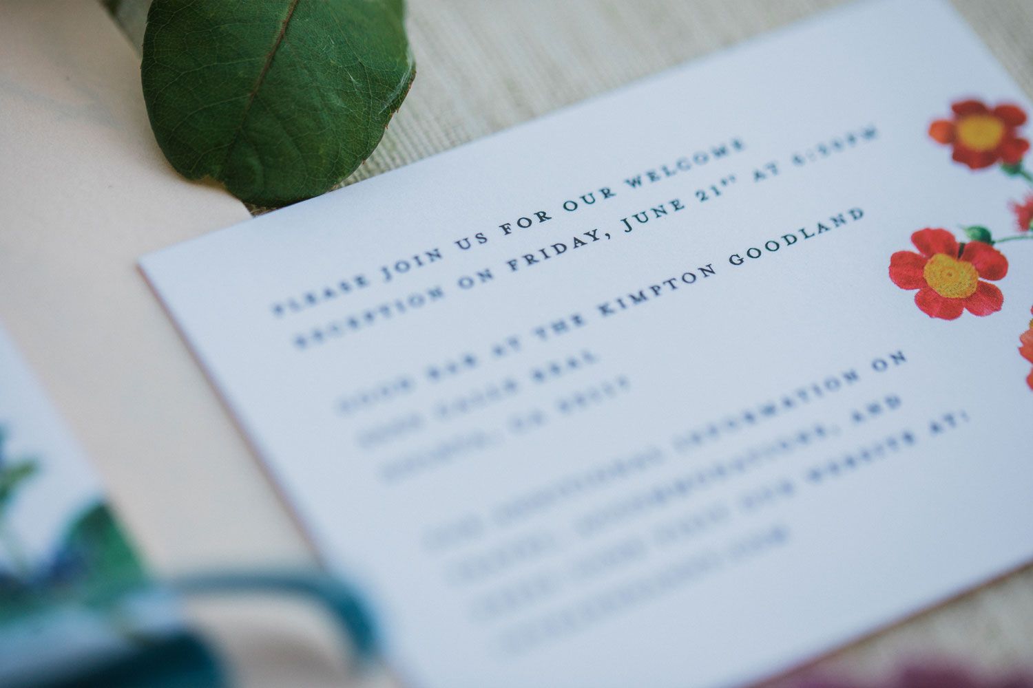
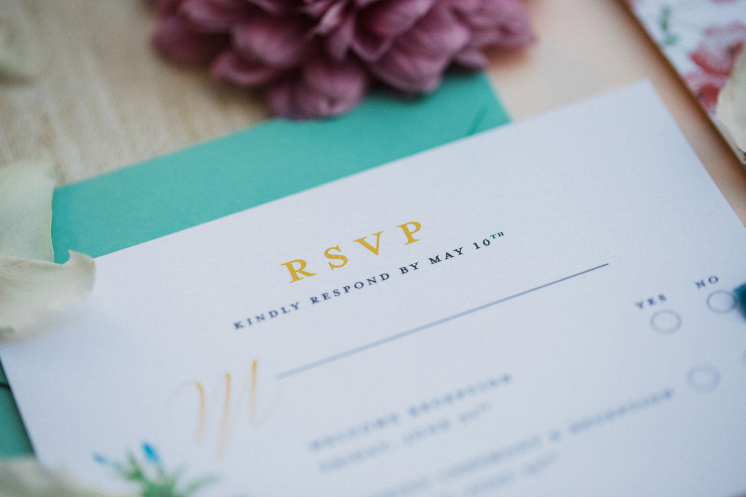
For this Santa Barbara wedding, the original idea was to try out a talavera motif, inspired on Mexican pottery and tile patterns. After some initial explorations, we decided to go with a more traditional floral pattern, using vintage flower illustrations found in the public domain, paired with elegant contrasting typography. We printed this suite digitally, with colored envelopes and liners, and extended the design across other collateral such as menus, place cards, and table numbers.

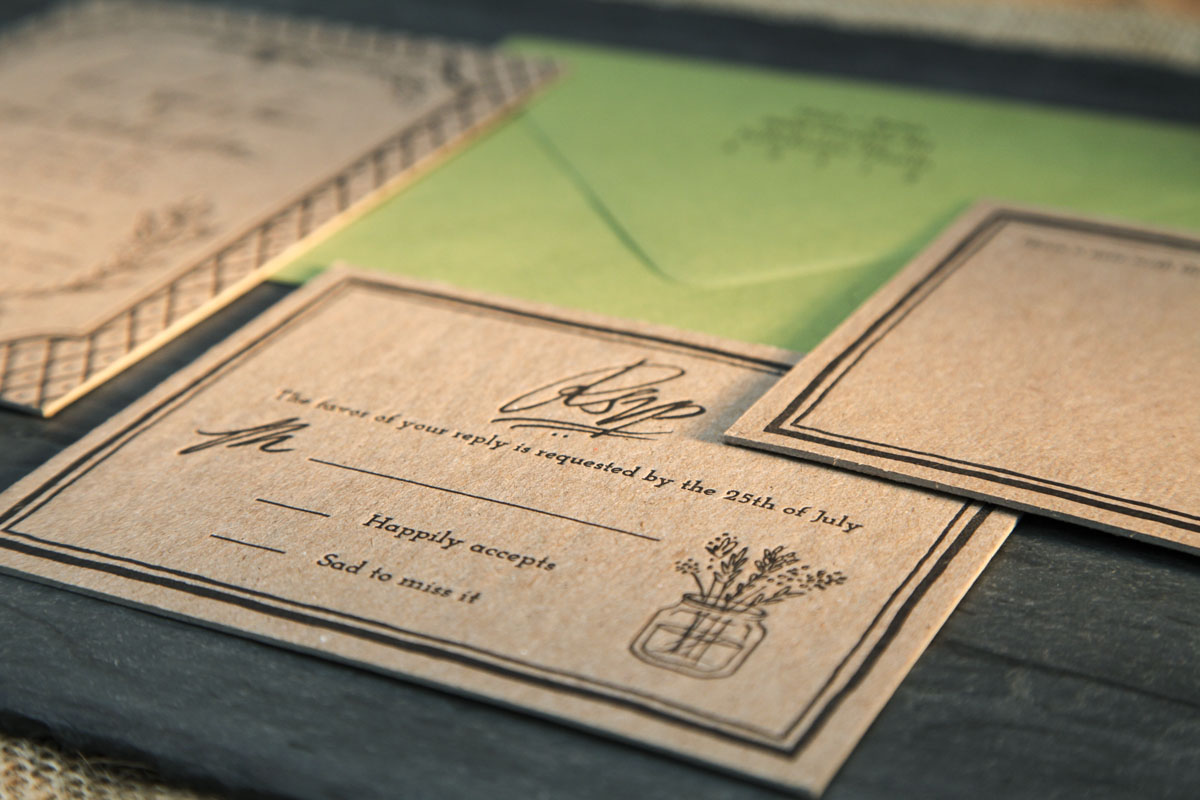
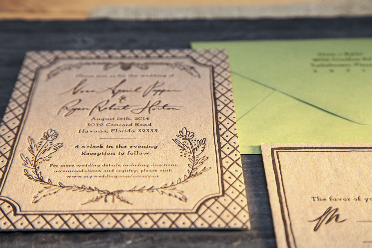
NORA & RYAN
For my sister’s farmhouse wedding, I incorporated hand-drawn elements in a design that was letterpressed onto 110# kraft cover stock for a rustic feel. Contrasting kiwi green envelopes were chosen to complete the look.
Photos by Jenna Saraco.
Photos by Jenna Saraco.